


![#thedailymoments || Week 4 [in honor of my dearest Debi]](https://images.squarespace-cdn.com/content/v1/55035a45e4b0bf46165be20d/1533277489778-672U8T4ZI5X0HEVLZTID/IMG_8387.jpg)
If you haven’t already read my basic photography tips to create a curated style, it’s best to start here.

How I edit my photos and the apps I use to create a consistent aesthetic in my Instagram feed
Favorite Apps
I usually end up using between 1-4 apps from start to finish when editing my photos before posting on the gram. I feel like I have tried them ALL, and finally found the ones that work the best and are quick and easy! Some of my favorites are Lightroom [free], snapseed [free], retouch [free] and unfold [for my stories] and VSCO [free].

VSCO
After using VSCO forever, which totally worked to start with, I switched to Lightroom and I don’t think i’m ever looking back. VSCO has some really great one click filters you can apply and it’s a great place to start for beginners! Favorite filters are A6, M5, and I used G6 for a long time. You have the ability to copy and paste the same filter to multiple images at the same time, so this always helped plan a consistent style and easily edit blog posts that had multiple images. I still adjusted all the things even after I applied a filter so, you can use the same tips I’m sharing below from lightroom, in VSCO. Start by adjusting the strength of the filter and then focus in on the exposure, white balance [temperature], and HSL [color saturation and hue].

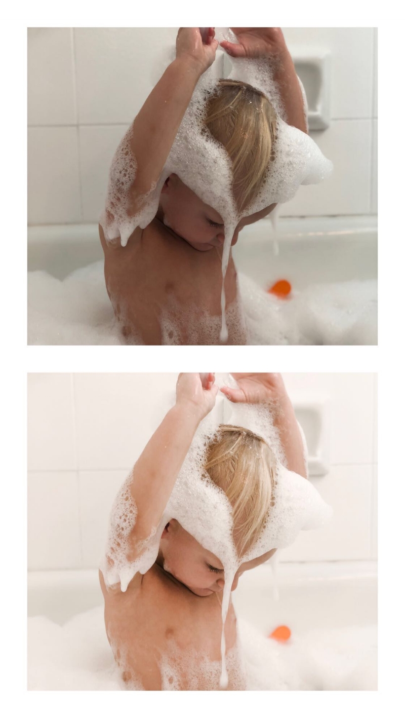
BEFORE

EDITED WITH VSCO A6 FILTER

EDITED WITH MANDI NELSON PRESET IN LIGHTROOM
Even though VSCO’s filters are basically free [some you pay for] and presets can sometimes get pricey [anywhere from $30-$120 for bundles] I switched to Lightroom because I liked the professional preset options better, as it adjusted more things for me ahead of time. With VSCO I would spend so much time perfecting the tweaks because their filters just didn’t work on all my photos and sometimes a I just couldn’t find the right adjustments to make it consistent with my feed. Lightroom has presets made by professional photographers and I found they made more changes built into the preset that made it really easy to get a consistent and professional look to all my images no matter where or when they were taken. One thing I do like better about VSCO is you can edit the strength of the filter as a whole, vs in Lightroom you can’t adjust the intensity of the preset.

BEFORE

EDITED WITH VSCO A6 FILTER

EDITED WITH MANDI NELSON PRESET IN LIGHTROOM
LIGHTROOM + PRESETS:
After 3 years and countless apps and filters, I found the easiest way to get a consistent style from all my images is to apply a preset in the Lightroom photo editing app. They have a mobile version or a desktop. I have both, but to be honest, I find myself using the mobile version 90% of the time, and it’s free!
I went through so many Instagram accounts to find the presets that worked best for me. I like a natural look with crisp, cooler feel with a hint of orange, less yellow and muted greens. If that makes no sense to you, don't worry, just find someone you like and try it out. You can give any preset your own stamp by adjusting things like the exposure, tint, temperature and color hues and saturation [skin tone]. It took me about two months to really start to understand what changes when I adjust what, but now I really think I’ve got it down!

BEFORE

EDITED WITH VSCO A6 FILTER

EDITED WITH MANDI NELSON PRESET IN LIGHTROOM
Current Preset:
I love how crisp and cool her's are-but I adjust the oranges and yellows quite a bit. [I'll show you how I use hers in a later in this post]. You should also go to her story highlights on her IG there’s a crazy amount of good tips on there and she reviews tons of FAQ’s about lightroom + how to use presets. Here’s just one example of how you can really have your own style, even when using a preset. Mandi’s feed vs my feed using the same lightroom preset still look very different because of our photography style and editing.

Previous preset:
These are what I used for my first 3 or 4 installments of #thedailymoments and about 3 weeks on my Instagram feed.
Steph Pollock suggested her and uses her presets beautifully. You can see below the difference between my style and Stephs. It just shows you how diverse a preset can be and that by using a preset someone else uses, doesn’t always mean your images will look exactly like theirs. It’s all in how you shoot, the lighting, editing angles and how you adjust the presets.


Other Presets I love:
Jenna is a beautiful soul, excellent photographer and someone I adore! Her presets are perfect for the beginner because she gives you a ton of easy one click options that don’t need a lot of adjustments.


EDITED WITH JENNA KUTCHER PRESETS
Her presets make me feel like i’m sitting on a white sandy beach. Such a pretty and calm vibe.


BEFORE

EDITED WITH BETHANY POTEET PRESET
I mean, don’t you just want your whole house to look this crisp, clean and happy?

If you want a moody or warmer fall vibes, love this mamas presets.


BEFORE EDITS

EDITED WITH SOPHIA ELRAE PRESETS - COOLSAGE
Adjustments to presets [lightroom] or filters [vsco]:
The first thing I do to my photos is apply my preset and then I adjust from there. I focus on 3 things, exposure [brightness], temperature [warm or cooler] and color saturation [skin color and landscape vibrancy]. I also adjust the sharpness or grain if the image needs it but not always, this is already done in my preset, so it’s one less step to edit.

First edit, add preset

Then adjust exposure + shadows +highlights

Go into Color tab, and top right is the MIX where you can change each color individually.

I typically change the yellow to get rid of artifical light and then orange to adjust skin tones.
Exposure
I almost always [ok, always] adjust the exposure. I try and take all my photos underexposed or not in direct sunlight so that I can adjust the brightness myself once it’s in the app. I adjust exposure right after I apply the preset and then also after I do ALL my other edits to the preset. I sometimes need to go back and lower it if it’s too bright and lost some contrast or brighten it if it is still too dark.


Temperature
This can help take a blan photo to a whole new level, adds yellows and oranges [warmer] or blues and greens for a cooler feel. I don’t adjust this much anymore, I use the Color Mix to really change each color. But, it’s a good place to start before you get crazy learning the adjustments to specific colors.
Color Hue + Saturation [skin tone]
Thanks to @hellojessiemartin [she’s the best account to follow for really good photo editing tips] I learned all about this part of Lightroom and it’s really upped my photo editing game.
3 colors I focus on adjusting in my photos are the yellows, oranges and greens. Start with the color MIX tab.
yellow: Taking the yellow saturation down, gets rid of that horrible artificial light in most homes and restaurants and makes your images more white + natural [like they should be]. Practice this one with a bathroom shot. It’s amazing what taking the yellow saturation can do to your photo! If you take the luminance up, it makes them even more white and bright.


orange: this adjusts skin tones, this one you have to play with because it everyone has such different skin, it’s really up to you to see what works best for you. Use the color mix tab and adjust the saturation first, then hue to adjust the yellow, orange and red undertones in your skin. Mandi’s preset already takes down the oranges, so I usually bring them up a bit from where she has them.


green: this is mainly for my outdoor shots or images at home that have my plant babies in them. I take the greens down a little so that it doesn’t stand out in my photos. Grassy parks or front yards can get a warm touch to them if you take the green out of the photo a bit.

How I edit in lightroom mobile [step by step]
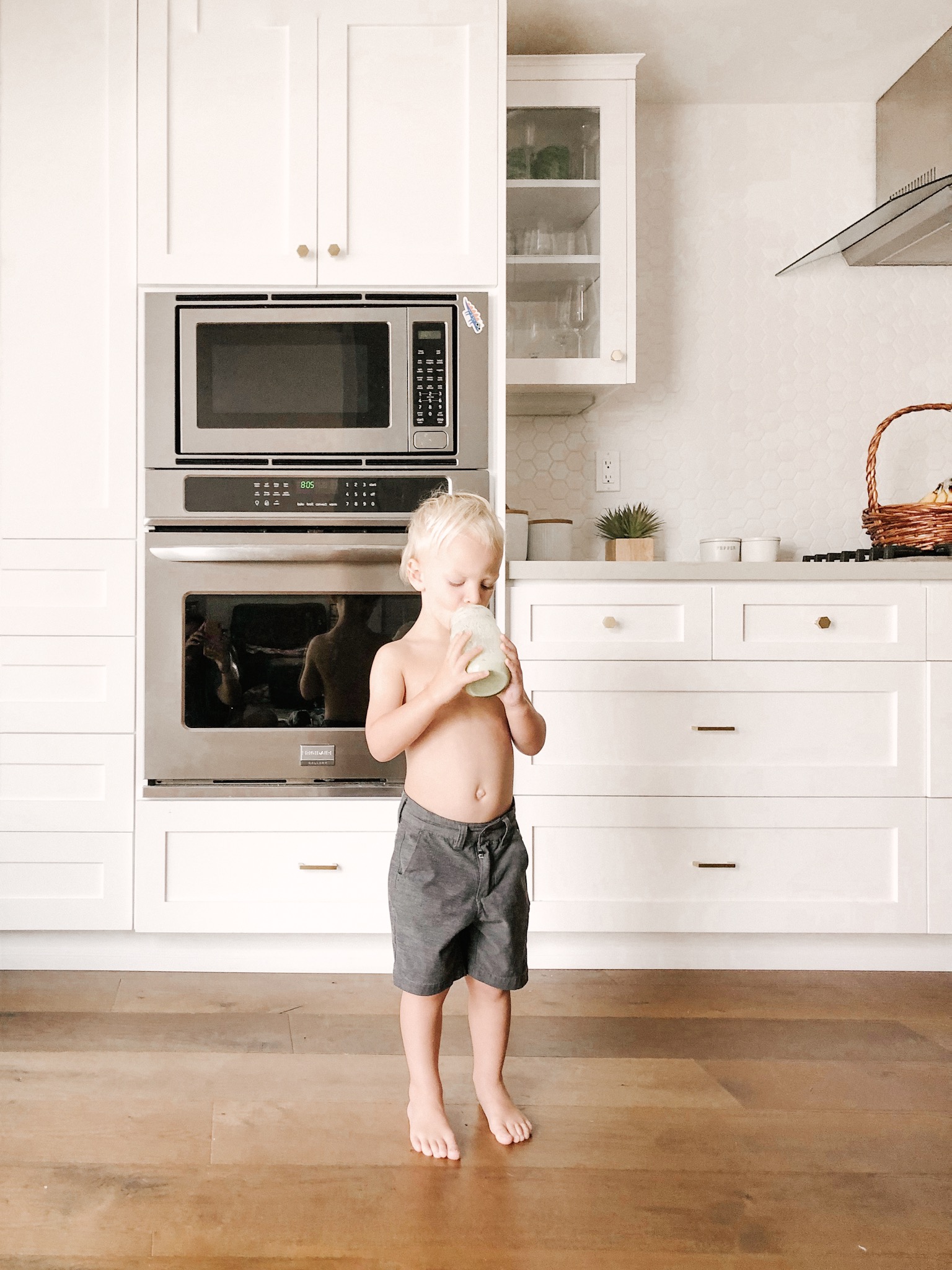
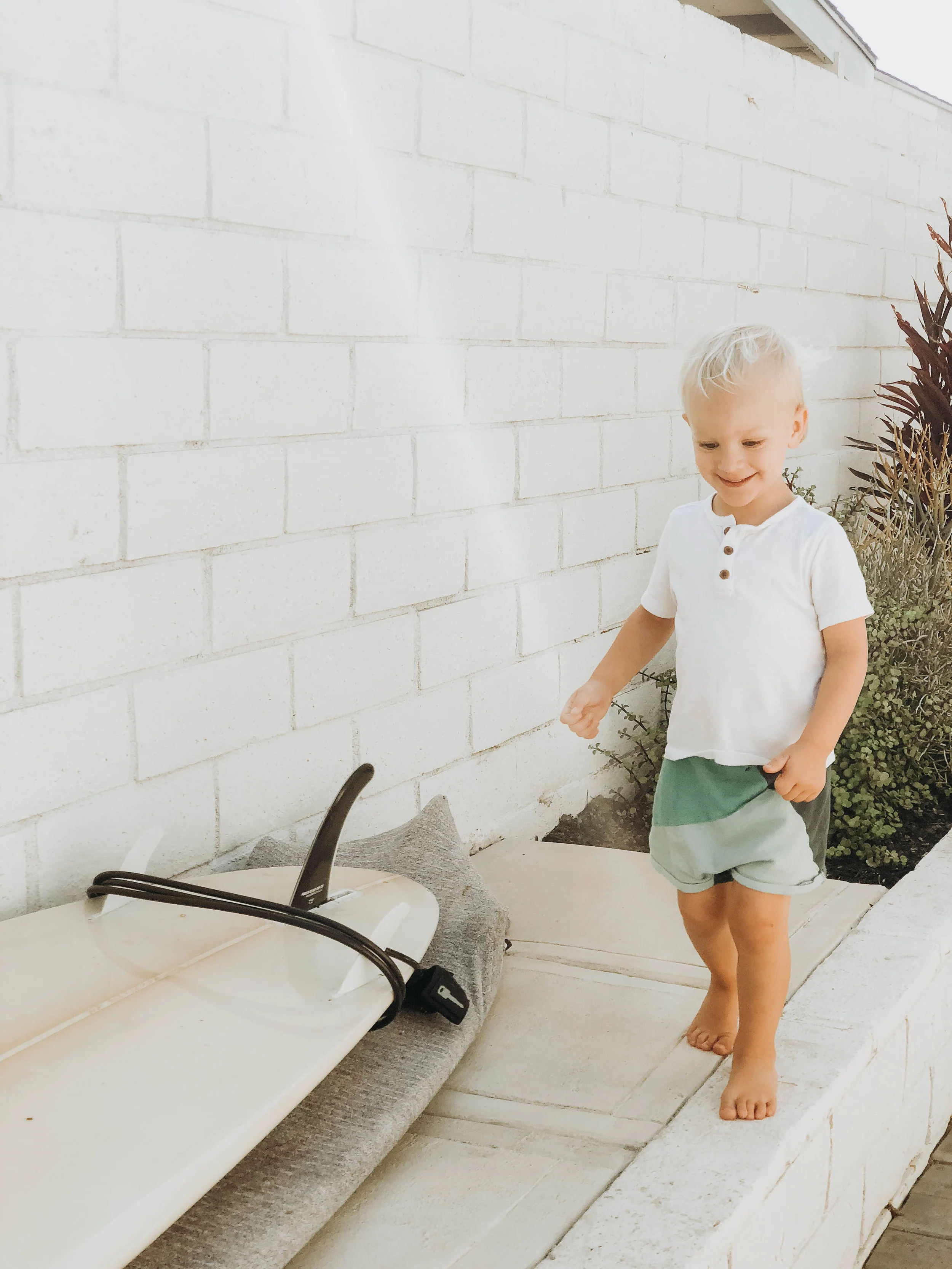
Here’s an example of an edit from start to finish. I snapped a quick photo of Finn on my iPhone X on a cloudy day. The lights weren’t on in the house and the front door was giving off some light behind him. Let me walk you through my steps in Lightroom.

IPHONE SNAP ON CLOUDY DAY -BEFORE EDITS
EDITED WITH MANDI NELSON - MINIMAL PRESET + ADJUSTMENTS
STEP BY STEP
Import photo into Lightroom mobile
Scroll the bottom all the way to the right - add PRESET [I click through each of my options to preview as some pictures look better with different presets to start with, but usually end up with EVERYDAY by MANDI NELSON].
*Depending on what preset you use these next steps may not apply to you. My preset already ups the shadows and takes down some colors, so you can use my screenshots as reference where they are.
[use the 3rd slide as an example- I took the oranges up to +24].
Scroll to the LIGHT tab - up the exposure quite a bit, Don’t worry if the skin tones look white here, you will adjust the colors MIX tab later and this will help fix that washed out look on the skin. Sometimes I take down the shadows too.
Scroll to the COLOR tab - on the top right, you’ll see MIX, that takes you into the colors so you can adjust individually. ORANGES - fix skin tone. Start with the SATURATION and then go to the hue until you find the tone you like.
Still in the MIX tab - click YELLOW. Adjust the saturation until you get the walls or whites in your photo the way you like them.
EFFECTS tab- personal preference but I like less grain in my photos, so I take that down a bit on MANDI’s preset.
To finish - go back to LIGHT tab, and adjust your EXPOSURE again to make sure you don’t loose contrast when brightening too much.
THAT’s IT!
That’s how I edit my photos in lightroom using the MANDI NELSON preset, EVERYDAY.

ADD TO LIGHTROOM, CHOOSE PRESET TO APPLY
![EDIT LIGHT - UP EXPOSURE +TAKE DOWN SHADOWS [IF NEEDED]](https://images.squarespace-cdn.com/content/v1/55035a45e4b0bf46165be20d/1537982720932-HFJM0QN69M2XCLP9GLRK/MANDI+NELSON+PRESET+EDITING.jpg)
EDIT LIGHT - UP EXPOSURE +
TAKE DOWN SHADOWS [IF NEEDED]
![COLOR TAB - MIX [TOP RIGHT CORNER] ADJUST ORANGES [SKINTONES]](https://images.squarespace-cdn.com/content/v1/55035a45e4b0bf46165be20d/1537982766501-Y0H0217X6UD76VUBJV30/IMG_5132.jpg)
COLOR TAB - MIX [TOP RIGHT CORNER] ADJUST ORANGES [SKINTONES]

ADJUST YELLOWS - TAKE THE SATURATION WAY DOWN TO FIX ARTIFICIAL LIGHT

ADJUST THE GRAIN. THIS IS TOTALLY A PERSONAL PREFERENCE BUT I LIKE LESS GRAIN.

GO BACK AND ADJUST EXPOSURE AGAIN IF NEEDED
OTHER PHOTO APPS I LOVE
SNAPSEED -
Oh how do I love this app so much!
Snapseed not only can adjust the colors of your photos, but it can adjust parts of your photos, it can auto correct your perspective and it can even EXPAND your image if you didn’t take those two steps back before snapping like I suggested. I’ll work on a tutorial of how I use them next because I actually use this one a lit to change the angle, and perspective of my pictures.
RETOUCH -
The best healing app out there. When I say healing, I mean get rid of that lady on the beach standing behind the perfect capture of your little one, removing the tv wires from a photo or the telephone wires from a super cute shot of the family. This app is super easy and makes it easy to get rid of all the little things you don’t want in a picture.
UNFOLD -
Unfold is the app that takes your IG stories to a whole new level. Picture collages never looked so good! You can add fonts, background frames and even upload videos and images on the same slide.